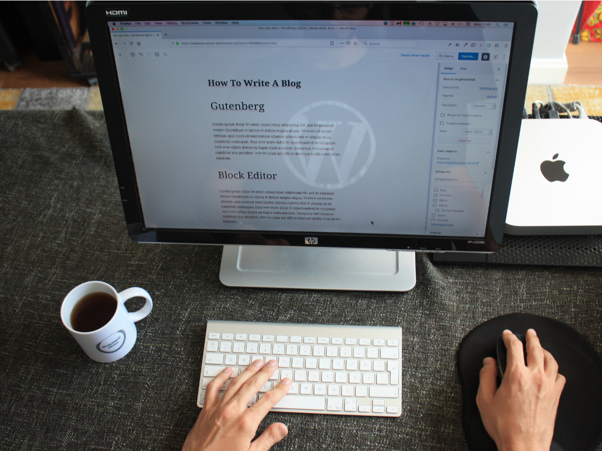
Before anything else, I would like to say that Gutenberg is an excellent tool. I think it a huge step forward; it brings exciting experience when working with an editor. So, do not get me wrong; I am not against Gutenberg. But.
The rise of Gutenberg creates an eco-system around this editor. Many developers and agencies have been declared strong support of Gutenberg in their themes. Many new ‘gamers’ enter the market with their free and pro extensions which, in turn, add a massive amount of blocks. However, I would like to question the quality of blocks created by third-party extensions. In my opinion, using them leads to creating bloated web sites. To support my concerns, I would like to show a screenshot of CTA section made by one of the popular extensions called Qubely.

Let’s take a second look at the part where a title is:

It seems to me that there are too many div’s for such simple section. Such excessive use of div’s! If it is not called ‘bloated’, then what is?
Well, Gutenberg itself is pretty spartan, you know. Let’s check Related Posts block:

Just the right number of HTML elements, adorable. It is not a CTA block like in the previous example simply because I could not find such block in Gutenberg 7.3 (plugin).
I think that all those Gutenberg extensions try to prise the customer in any possible way and they start using harmful practices. They lose the concept of better web development. Let’s check another one called Stackable and its CTA section:

Slightly better, still too many. Ok, another one example of CTA section from the extension called Ultimate Gutenberg

OMG, again, why? Why so many div’s for such simple section? I understand that each of these blocks offers a tremendous amount of settings which are called to customise every aspect of the block. But I do not think they are moving in the right direction.
What do you think?
Comments are closed.
I’ll agree, there is to much bloat going around the WordPress world at the moment and it doesn’t stop with blocks.
I am not a fan of the Gutenberg editor. Although I agree, that it was time for an editor upgrade, probably driven by the sharp rise of bloated page builder plugins and themes. However, the fundamental rule of every “CMS” has been violated. The rule/law was the strict separation of content and design.
How one goes about updating a WP site built with third party blocks a couple of years down the road, is a mystery to me.
Gutenberg still pretty young, maybe they will find the way to deal with it. Maybe not. However, at the moment, it is really happening – the violation that you mentioned(
We noticed this when building our blocks plugin too so we kept the Frontend markup to a minimal.
Keeping the settings minimal also helped us keep our plugin pretty lightweight considering it controls all of the layout with bootstrap and css grid.
There’s a ton of backend markup with Gutenberg but it seems there’s no way around that.
The problem with this approach is that you add “bootstrap” dependency. Since you cannot add only part of the library, you have to add the whole bootstrap. It adds weight to the page.
Any thoughts on the free Go theme (https://wordpress.org/themes/go/) and the free CoBlocks plugin (https://wordpress.org/plugins/coblocks/)? They are supposed to be Gutenberg first–do they avoid this bloat issue? If not, what are good Gutenberg plugins/themes you recommend?
Out of curiosity, just checked CoBlocks plugin. Its Media Card block uses 5 div’s where, in my opinion, it would be enough only one. So, yes, I think Blocks by CoBlocks add bloated markup.
As for the theme – I don’t know, it is another beast)
I’ve been voicing concerns about this from the beginning, but from a slightly different POV. I feel the fundamental issue is there are no markup standards like there were for widgets. Each new block reinvents the wheel and declares all its own classes, each of those on a new div. Why wasn’t a set of standard utility classes defined such that every new block got a unique wrapper, and then themes could set defaults for the interior elements. Then themes could keep doing what themes do, set standard global styling with requiring every block have controls for every imaginable layout and design tweak.
Such an interesting approach! But I have a feeling that this is not going to happen. Have you read the last proposals on what themes should be when Gutenberg become a site-wide editor? So, they definitely have totally different view on all of this.
Just curious, is it Ultimate Addons for Gutenberg you mean with Ultimate Gutenberg? There are several plugins named Ultimate Gutenberg (I know it can be a part of a longer name) but I have to ask. BTW I wrote an article about lock-in problems and bloated codes and gave you some link juice in it from this article =)
I reviewed Ultimate Gutenberg plugin made by Brainstorm Force. Yes, there is plenty of them with same/similar names already))
Please, share a link to your article.
Of Course, but it’s written in Swedish https://kaxigt.com/funderingar-kring-gutenberg-blockredigerare/
Did you have a chance to look at Kadence blocks from the makers of Kadence theme? It’s mentioned as a well coded plugin by many people, but I can’t say for sure since I don’t code.